GLAZE NOTES
glaze technique
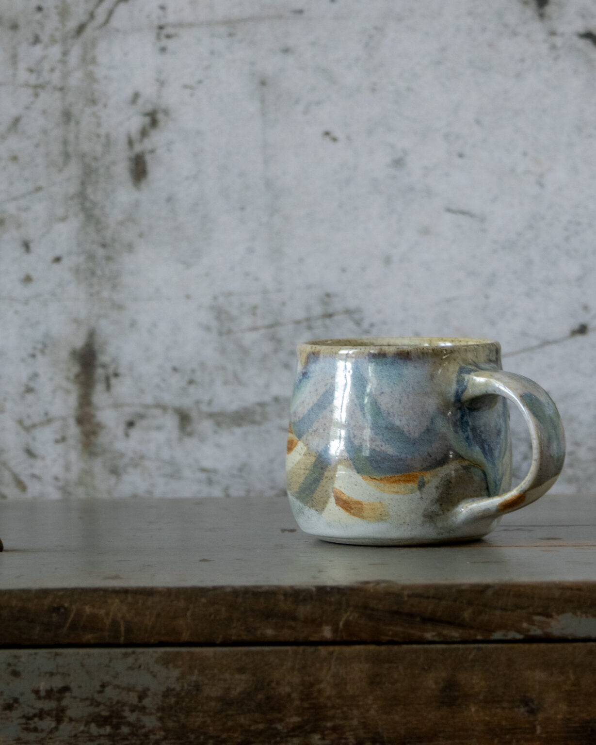
- Matte Dove Grey Base to top of the vessel interior and exterior. Wipe back rim.
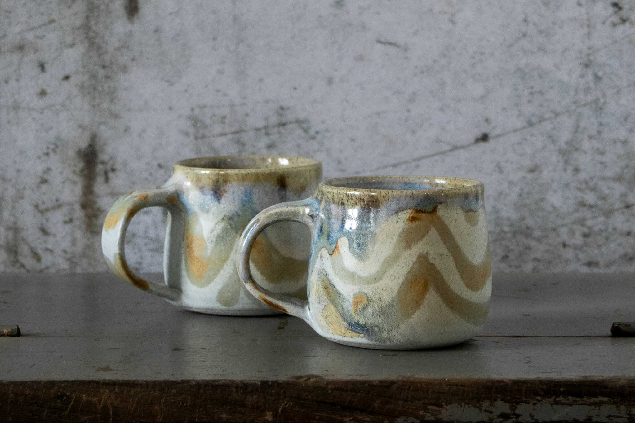
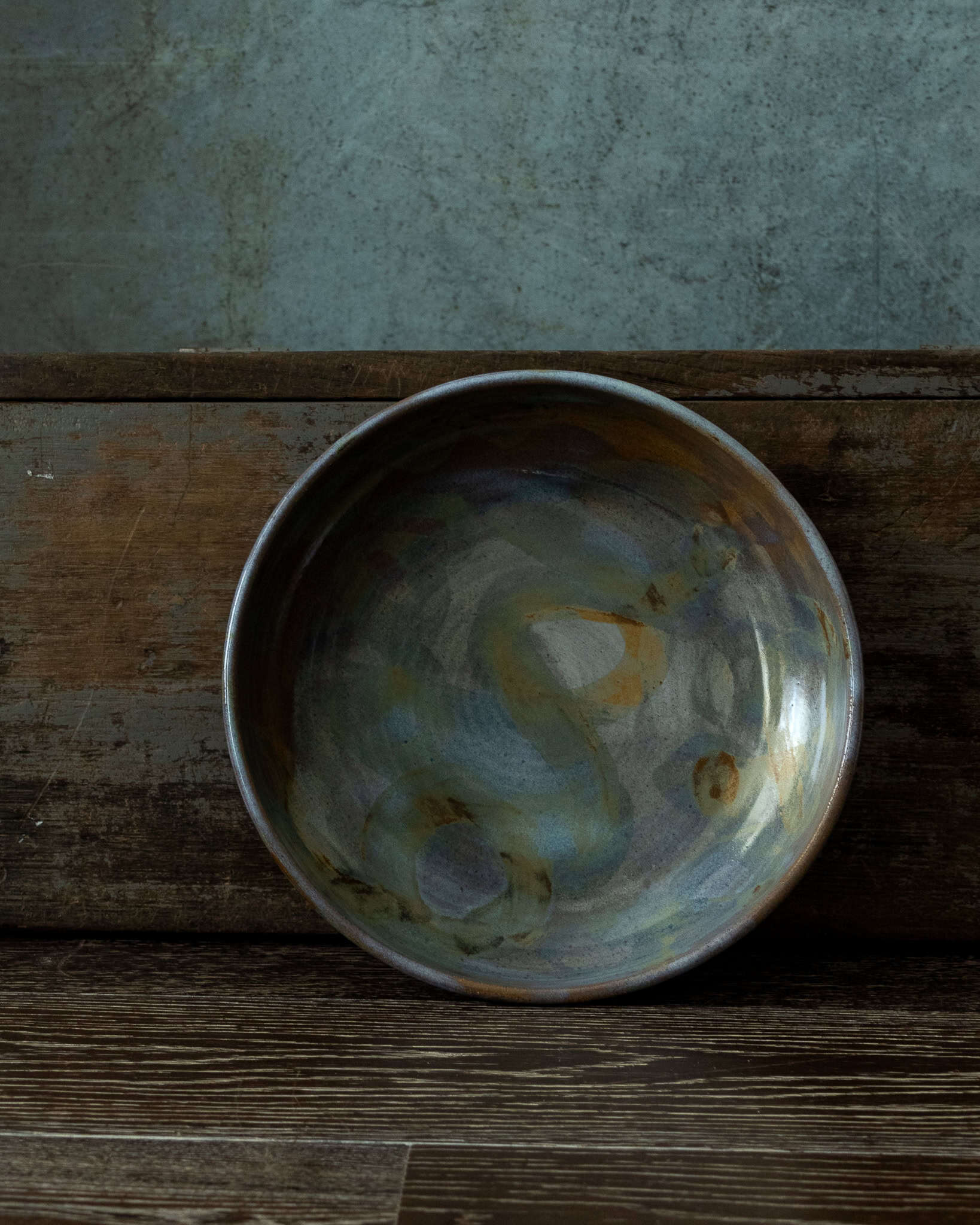
- Matte Tan (10 Titanium / 10 RIO) iron brush symbols on top of matte dove grey. Layer the brush stroke in sections, thin to thick for colour variation and depth.
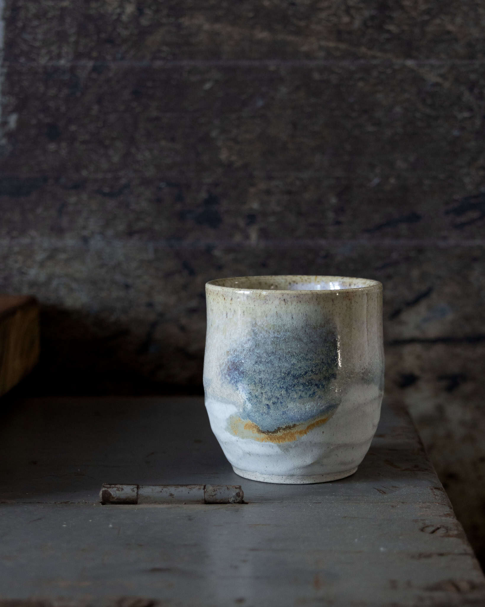
- Dip of Blue Rutile (BR) over the rim on one side to cover the handle on the other side (heavier dip over the handle so that it pools into the inner base of the handle and the imprint at the top of the handle, accentuating and deepening reaction with the iron brush strokes).
- Where BR covers the iron brush stroke on the body of the clay it turns blue, the blue is deeper and more reactive if iron brush stroke is layered a number of times.
- Apply dabs of BR on some iron brush strokes not included in dip.
- BR on the rim with some iron interplay creates a nice reaction. The glaze becomes quite transparent as it breaks over the rim so that the clay and the speckles in the clay are enhanced.
brush strokes
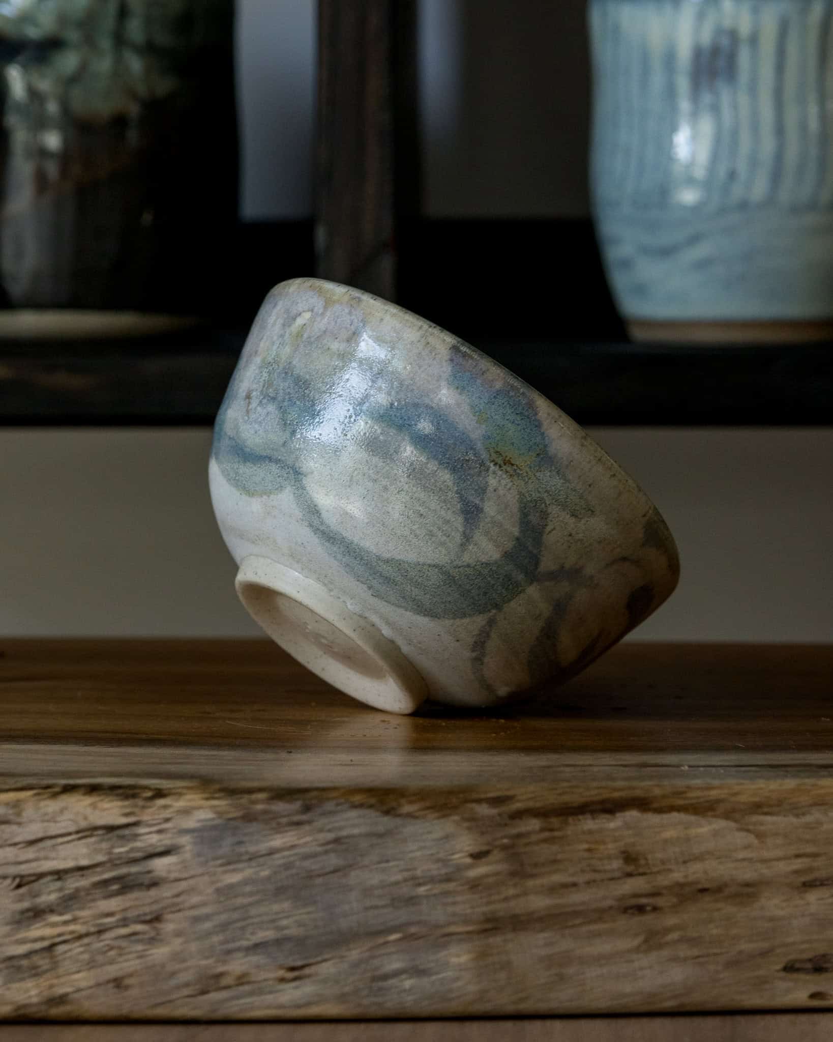
I have only recently started adding symbols to my designs using iron brushstrokes.. They are somewhat naive but when seeking a reaction they seem to deliver a pleasing end result. Creatively, adding the brush strokes has been a very enjoyable aspect of the glazing process and seems to be more in tune with developing my creative style. To improve this technique I have started drawing up my designs on paper to plan ahead rather than being overly experimental and random in the process of glazing. It is the reason for writing up my glaze notes here. It is very easy to forget how you created a particular design or reaction with a glaze if you are not keeping detailed notes.
CLAY CHOICE
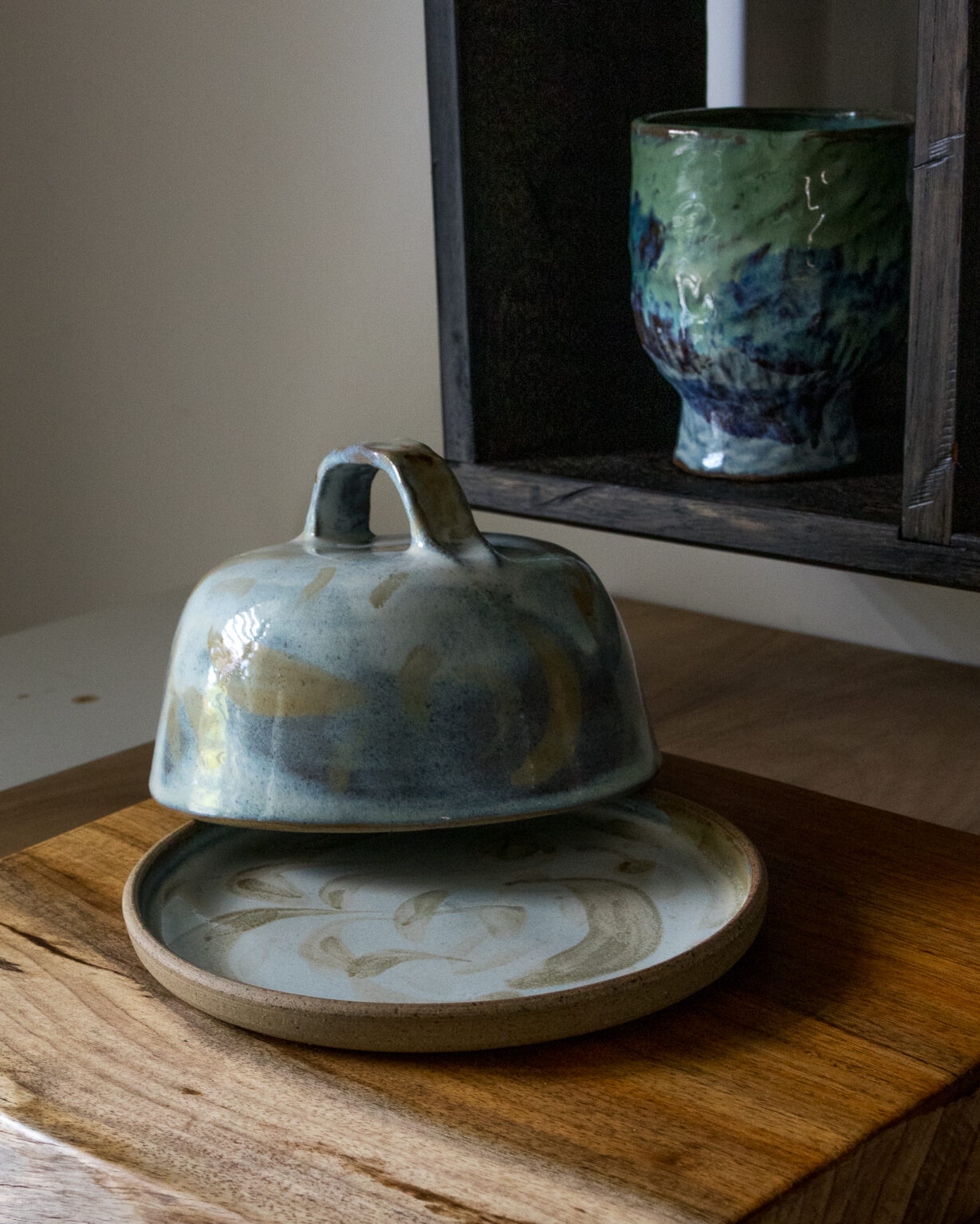
I’ve been using Keane’s Midfire 33 and Midfire 33 Warm for this particular glaze combination. The clay has a slight effect on the matte ‘dove grey’ base glaze. The opalescent blue cover glaze is affected by the clay colour, becoming a brighter blue with the increase of iron in the clay. However, when layered over the matte glaze it is toned down a little. I think there is a nice balance with the sandy and warm speckled clay and the colours and design of the glazes used.
Et Al Ceramics is a small ceramics studio in Williamstown. The intention of this blog is to share in note / journal form what’s happening in the studio and life in general.Looking forward to feedback and connectivity.